I had a rather exciting week last week. As well as buying a block of land for my next project, I got flown to Sydney by Taubmans, to take part in the 'Taubmans Great Colour Debate'.
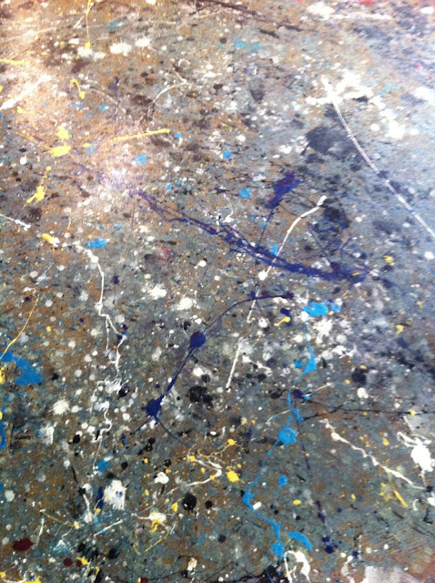
This was the floor of the venue.
Wild.
I learnt lots about paint technology ("paint is not just about colour, but also technology") and that great paint that they use on 'Selling Houses Australia'.
I'd heard of it (Taubmans, 'Endure') but I'd never really investigated what made it different to any other paint. Being a scientist by trade, I was in geek heaven. I like things to be scientifically proven.... with reproducibility and stats thrown in for good measure. Choice loves it... as an 'overall best performer'... and the Asthma Foundation have labelled it a 'sensitive choice'. I'll leave a link HERE for you to read all about it's goodness, as this is not a sponsored post . This is just me telling you about my fabulous day.
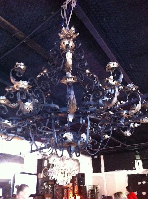
So we were in this really groovy place... with fabulous lights, paint splattered floors, vibrant fresh flowers, rustic table settings....
.... and seriously heavenly food.
Shaynna Blaze, the interior designer from 'Selling Houses Australia' and the newest judge on 'The Block' (they DID listen to the viewers and bring in a female judge!), talked about how the general public has lost confidence in colour. We see all these fabulously, colourful makeovers on TV and in beautiful magazines... and blogs! ...but the biggest selling paint colours are still the neutrals.....whites, beiges, off whites.
Why do we have such a fear of colour? (why do I have such a fear of colour?... I was asking myself quietly, hoping no-one would notice that my favoured aesthetic is a 'white washout'). Is it a hangover from the 70's and 80's...... mission brown, orange, yellow and bold patterns? Is it a fear of being judged? Is it a fear of failure? In the end it's just paint, you can paint over it. Yeah! I can vouch for that, painting over my 'royal blue' kitchen feature wall in the 90's to bring in the 'spiced apple'... oh those were the days! I used to love colour. What happened?
As Shaynna said, "we have been in a beige coma for way too long". The norm now is "layers of beige".
Shaynna made colour sound delicious and enticing, stating that "colour is like a complex woman. It's sassy, and moody, suggestive, manipulating, fun and nurturing". I didn't realise that colour names use such sensory words.....words that evoke such emotion... chocolate, latte, caramel, espresso. We link sentiment to colour. One participant told a story about a bright yellow room in her mother's home. The 'yellow room' was saved for all the special occasions... birthdays, Christmas, celebrations, happy times. You'll never guess what the participant's favourite colour was! She is planning a yellow room in her own home. Sentiment exactly.
So how do we progress on from neutrals? As Shaynna said.... "we experiment". It's ok to make mistakes. It's very low risk, very low cost. It's not failure.
Nadine, from Taubmans, cited an interesting study that showed people who made a big mistake with colour in their home were more likely to live with it longer and not change it... compared to people who were happy with the colour in their home. The people who had made a good colour choice, and lived happily with it, were more likely to change their colours more often!
How cool is this?
I digress.
We discussed colour in small spaces.. as our homes are becoming smaller. It was suggested that you link your wall colour to your floor... and don't create blocks of colour.... block of couch, block of rug. Don't use jarring colours (opposites on colour wheel). Don't create levels of colour in a small space .... keep skirtings, architraves, cornices and walls in a similar colour, no more than 1/2 a shade away from each other.
I could feel a bit of a paradigm shift, sitting amongst all these colour advocates. You will see colour in my next place. Big statement, but true. Colour beyond the accessories. Colour on the walls. I'm going to 'put my brave on' and start with tints. You can hold me to that.
I was most impressed with my goodie bag. As I said my favourite colour was blue, I got the most rocking electric blue nail polish, which is going to go down so well in orchestra!.... and that tin of Endure paint?... full to the brim of M&M's. We've made a start!
Thank you Taubmans. I got to meet some of the other wonderful invitees ...... from Vogue Living, Burke's Backyard magazine, Domain, Indesign, News Limited, Dec PR and Taubmans and Shaynna Blaze of course.
I had a lovely, happy, colourful day!


0 comments:
Post a Comment